The challenge _ Easycheck’s product had been built rapidly to meet urgent market needs, with most interfaces developed directly in code without design involvement. As a result:
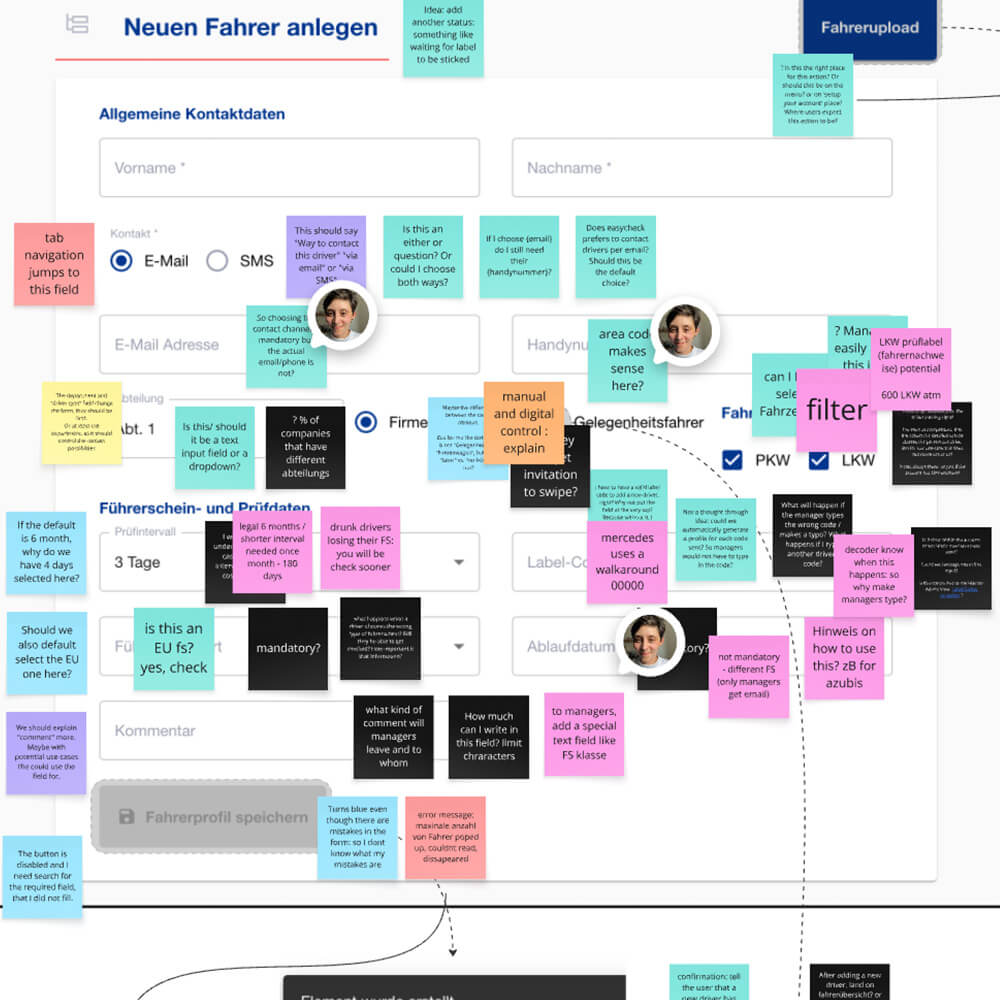
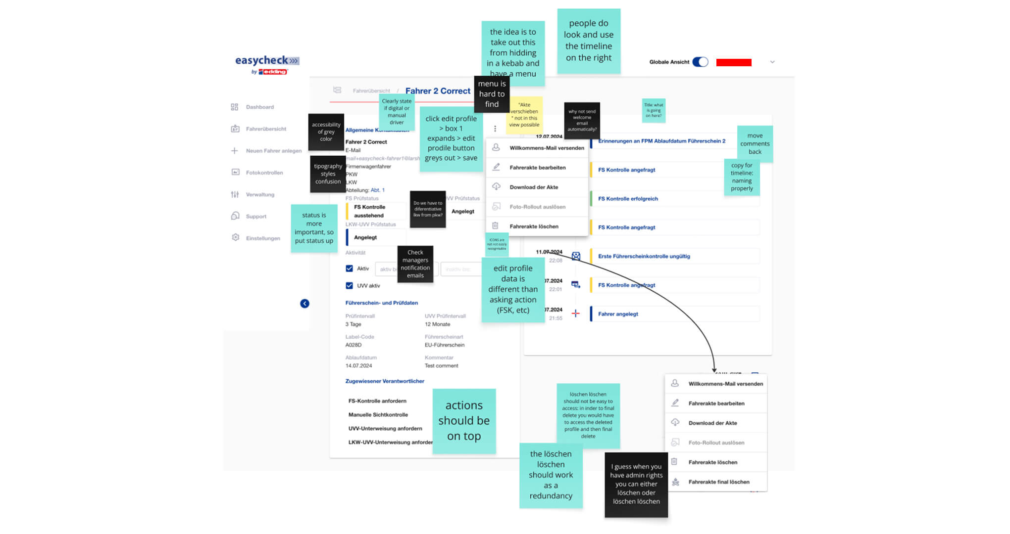
- • Every page of the platform had severe UX problems
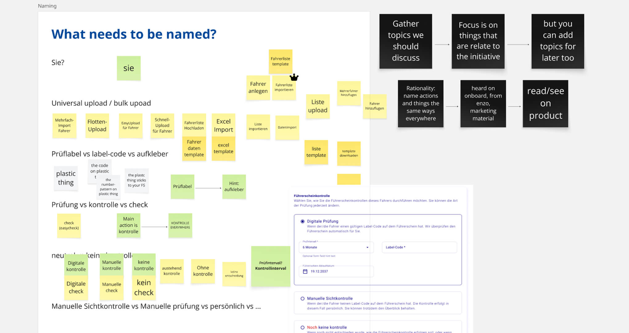
- • Text and terminology changed inconsistently from page to page
- • Section names and action labels were not standardised, confusing users navigating the system
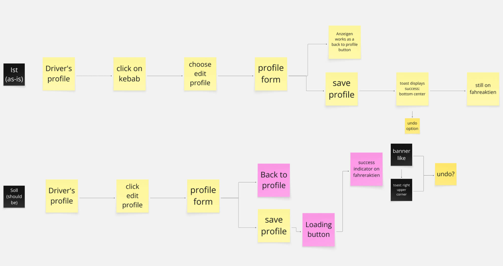
- • Button states lacked clarity, leaving users uncertain whether actions succeeded
- • System status and feedback were often missing, creating anxiety around task completion
The experience was fragmented, making it hard for managers and drivers to complete even basic tasks confidently.
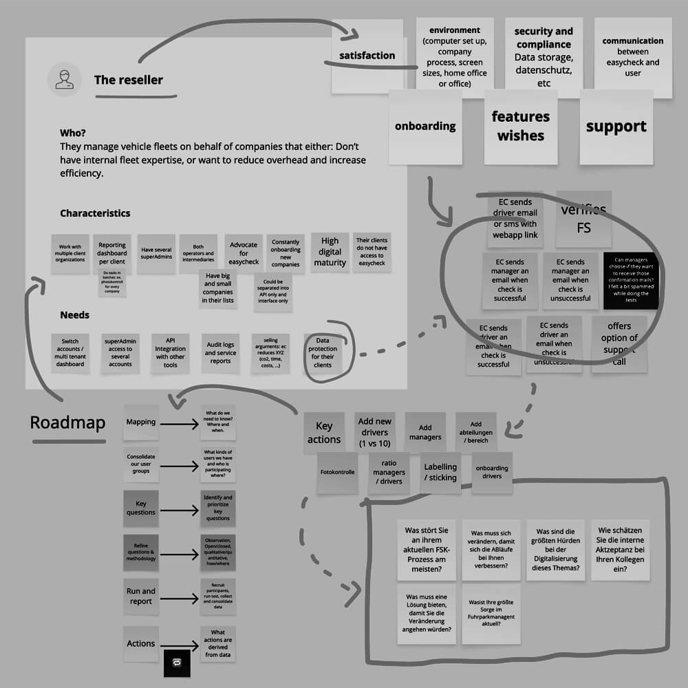
My process _ Redesigning a product with deep-rooted usability issues requires more than surface-level fixes — it demands a structured, methodical approach to uncover and prioritise problems across every layer of the experience. I approached this inspection as both a designer and researcher, combining visual analysis with behavioural evidence to form a holistic understanding of the system’s pain points.
- 1. Full product inspection: I systematically evaluated every section of the SaaS platform, mapping inconsistencies, friction points, and blockers for both manager and driver flows.
- 2. Detailed UI Inspection: I captured screenshots across all workflows, adding clear, actionable notes to document: Terminology inconsistencies, confusing navigation structures, missing states, feedback, and affordances.
- 3. Behavioural Validation with Recordings: To complement my inspection, I watched several user screen recordings, observing aspects such as points of hesitation and confusion, areas where unclear design forced workarounds, tasks abandoned due to lack of guidance.